Mid-State Construction
Graphic Design &
Branding
I always love a branding assignment.
I enjoy coming up with a look for a company or business. A
corporate identity needs to be created for any entity. What
sets them aside from others? How will they be recognized?
Mid-State Construction is just like any other
construction company, so I needed to make them stand out.
From a new logo to a website and company collateral, Mid-State
got their look.
As always, I began with the
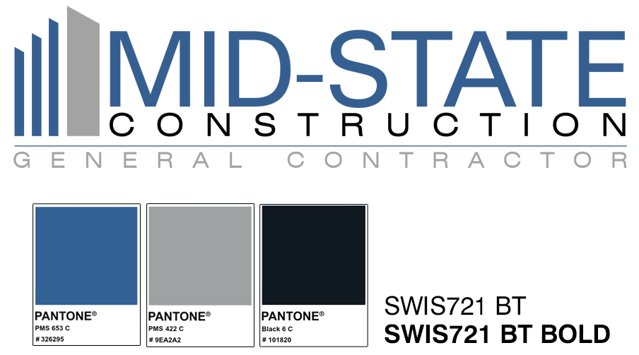
logo. Simple and to the point. It's a construction company
so there's no need to be overly clever. I used Swis721 BT
font with Pantone colors, PMS 653, PMS 422 and PMS Black.
Created an image for representation of buildings and...after
a few iterations...Mid-States Logo.

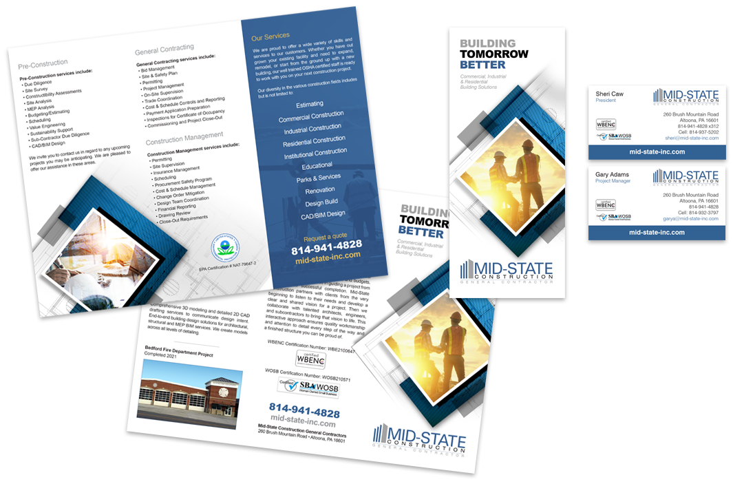
A well rounded corporate identity
will include all business collateral, such as, business cards,
letterhead, envelopes, brochures, and on. The key is to keep
everything consistent and uniform. Although the brochure is
4-color process printing, it follows the main Pantone color
scheme.

These days, a company is nothing
without a website. Customers want to look you up and see what
you have to offer. If you don't have a website, then you missed
out on the first offering. And may not have another chance.
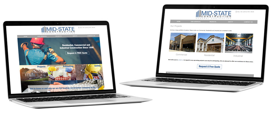
Mid-States website demonstrates and presents their work, clients
and how they run their business. I created Mid-States website
to create awareness and growth for the company, meanwhile
increasing their online presence by 100% and establishing
online marketing and sales.

