Labels and Package Design
Illustration, Graphic
Design and Branding
One of my favorite things to
design are labels and packages! I find it very intriguing
and visionary to make labels and packages. With this type
of design, you really need to solve the puzzle of functionality
and beauty. Package design has a purpose and needs to adhere
to that purpose, as well as look great and be eye catching
to attract customers. My labels on the average inspire potential
customers by 25%, therefore increasing sales.
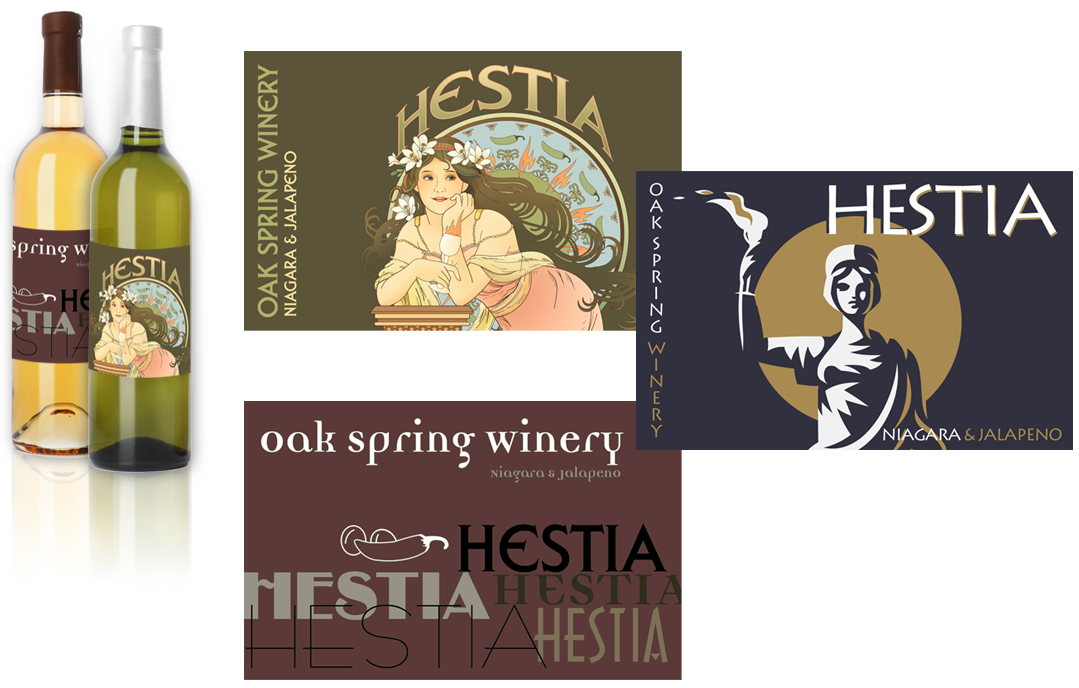
Oak Spring Winery
has a variety of different wines. From whites to reds, and
all shades and flavors in between. One of the latest flavors
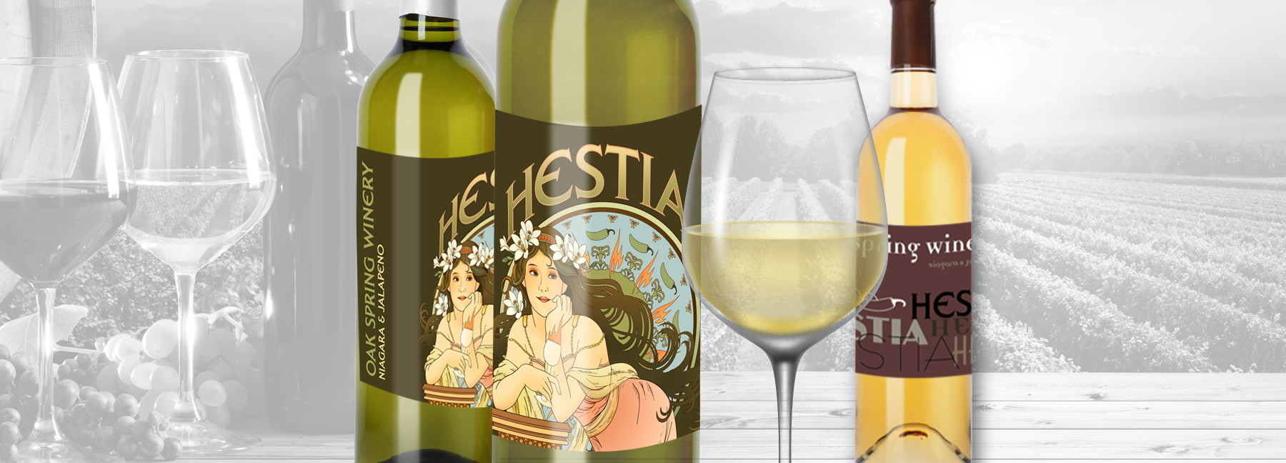
was their new blend of Niagara and Jalapeno, Hestia.
Sweet with a kick. The design had to be original and portray
the wine itself. I went through the iteration process and
presented a few designs to portray the flavor.

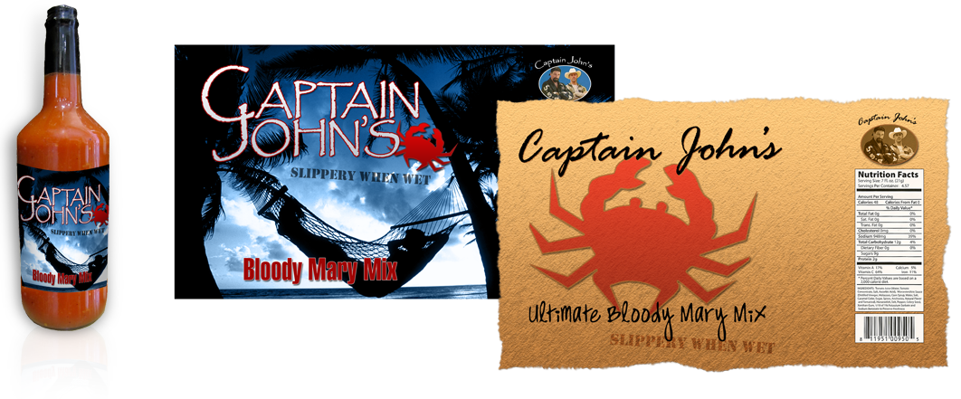
Along the same idea of wine
is Bloody Mary Mix from Captain John's.
This mix contained a splash from crab juice and was geared
towards the coastal demographic, therefore I needed to incorporate
a costal and/or crab look and feel. You may see this Bloody
Mary mix at your local seafood restaurant.

Package design comes in all
shapes and sizes. Each has its own quandary to tackle. Some
even have a specific budget to remain within, so your design
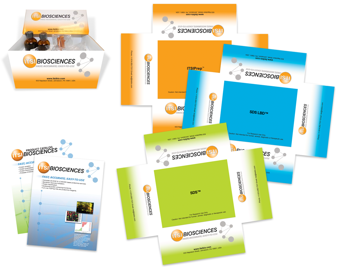
has to exist within those boundaries. One client, ITSI
Biosciences, had just that perspective on their packages.
ITSI had many products that needed to be set apart from each
other, but with a limited cost. The solution was a simple
box design with a three color print. The three color printing
would save huge amounts of money for the client, while still
giving them what they need. The color scheme continued into
their other company collateral, although the catalogs did
have 4-color process printing.

