The Meadows
Illustration, Branding
and Graphic Design
What's the popular hangout,
that's right The Meadows - Original Frozen Custard!
Since the 50's people have been going to The Meadows on a
hot (and cold, I can't explain it) day. Each day they present
special flavors for the day. Begriming as a single owned ice
cream store, The Meadows is now a successful franchise with
an annual revenue of up to 5 million dollars.
So let's get back to the 50's,
when it opened. Well all their artwork was from then as well.
When it came time to franchise and become modern there was
no digital artwork, plus they were beginning new aspects which
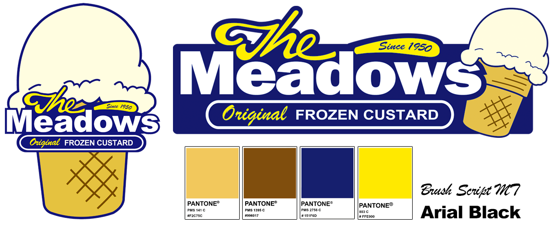
didn't have any branding. The first thing was to recreate
the original Ice Cream Cone. I recreated the cone logo in
Adobe Illustrator, embellishing on the design slightly. The
Cone Logo and Main Logo utilize the same colors. Pantone System
Colors, PMS 141, PMS 803, PMS 2756 and PMS 1395. With these
colors all logos are produced. Fonts: Brush Script MT and
Arial Black.
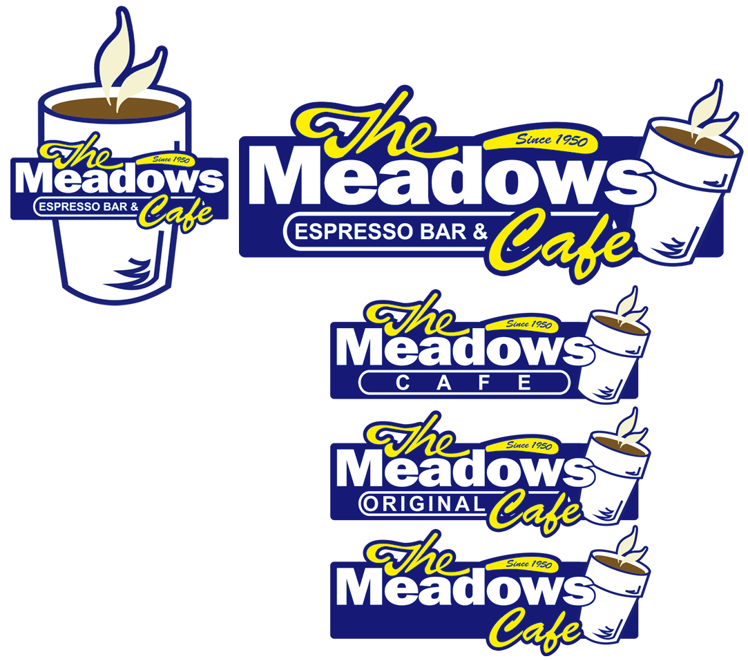
The Meadows was expanding and
introducing a coffee bar. The next step was to determine a
name and branding for this new aspect of the company. The
Meadows Espresso Bar & Cafe became the winner after many
iterations. I created a new brand, logo and some icons for
the espresso bar identity.
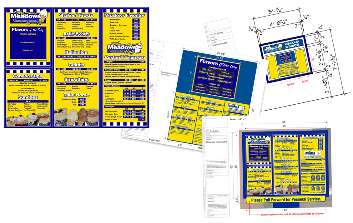
There are many aspects to the
ice cream store, signs, counter and drive-thru menus and advertising
became a focus for consistency and branding within all franchises.
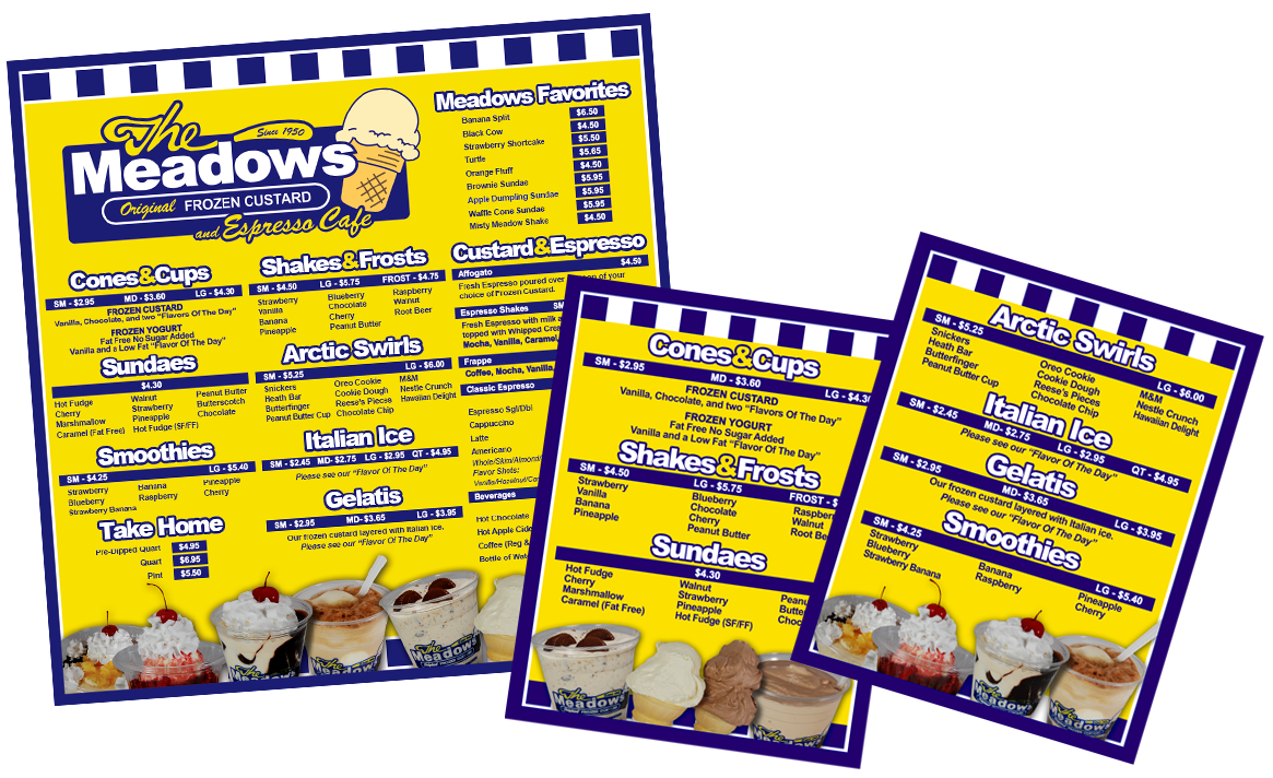
The Drive-Thru Menu board and
sign. Design and structure. CAD drawings.
